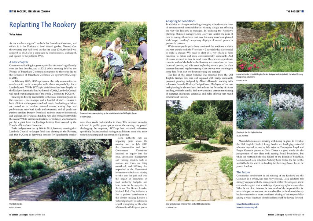
This article was published in the Autumn/Winter 2016 edition of London Landscapes. I was especially pleased that the editor, Susan Miles, chose some of my images to use alongside those by Joel Antunes.
Garden of Remembrance, Marburg, Germany, by scape Landschaftsarchitekten GmbH, Düsseldorf, Germany
There is an open space in Marburg’s otherwise built-up city grid, a space that marks a significant absence. A synagogue designed by architect Wilhelm Spahr stood here from its completion in 1897 until its destruction on “Kristallnacht” — Nov. 9, 1938. From that point forward, the Nazi regime escalated the persecution of the Jews in Germany and Austria. Many synagogues were destroyed, along with the communities that built them.
All but annihilated in the first half of the 20th century, Marburg’s Jewish community has since begun to rebuild itself, and its members have been determined to turn what had long been a gap in the urban fabric into a space that would be both a meaningful memorial to the people and culture destroyed in the pogroms and a public space integrated into the life of the city.
Read the full article here.
In this article for Landscape Architecture Network, Can landscape architects use history to make a city stronger?, I explore the importance of a strong narrative – in this case the city’s history – in creating a new design to revitalise the city centre.
Cities must adapt if they are to survive. Faced with a shrinking, aging population in its city center, the municipality of Celje resolved to redesign and revive Celje’s open public spaces. For the most recent stage of this work, they engaged Darja Matjašec, Sergej Hiti, and Klara Sulič of LUZ. As landscape architects working in Slovenia, LUZ’s designers are experienced in negotiating the delicate balance between honoring the past and creating spaces for the future.
Read the full article here.
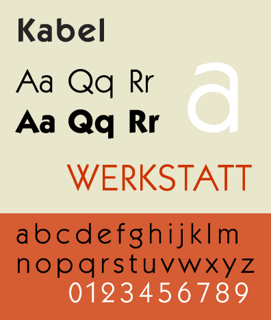
Commissioning work from any creative professional is a fine balance between communicating your needs, and leaving room for the designer’s vision. I’ve just commissioned a logo, and couldn’t be happier with Sonja Cresswell‘s hand-drawn circlet of leaves, simultaneously delicate and strong. The font she chose to complement it is Kabel, an early sans serif German font from the 1920s. I love that it draws on the Roman tradition of carving letters with just a few geometic forms. There’s a touch of Art Deco in there, too, and the name references the first trans-Atlantic cable, newly laid when the font was first in use. The combination of clean, geometrical lines, a nod to history, and fresh green leaves seems very appropriate.