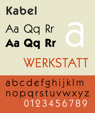
Commissioning work from any creative professional is a fine balance between communicating your needs, and leaving room for the designer’s vision. I’ve just commissioned a logo, and couldn’t be happier with Sonja Cresswell‘s hand-drawn circlet of leaves, simultaneously delicate and strong. The font she chose to complement it is Kabel, an early sans serif German font from the 1920s. I love that it draws on the Roman tradition of carving letters with just a few geometic forms. There’s a touch of Art Deco in there, too, and the name references the first trans-Atlantic cable, newly laid when the font was first in use. The combination of clean, geometrical lines, a nod to history, and fresh green leaves seems very appropriate.